FFG has published two whole decks using full bleed (ie. with no border) design:

https://www.fantasyflightgames.com/en/news/2016/1/11/run-like-a-champ/
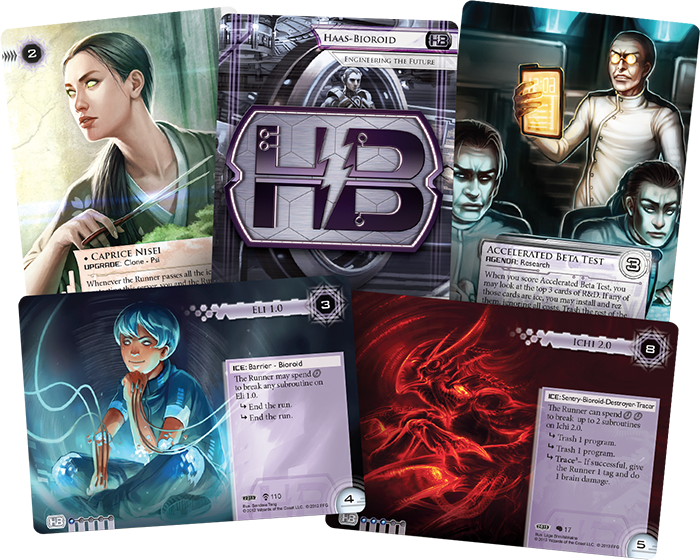
Top-Notch Design
With their proven pedigree and their gorgeous new graphic design, the 2015 Android: Netrunner World Champion Corp Deck and 2015 Android: Netrunner World Champion Runner Deck offer an exciting new way to delve more deeply into the cyberstruggles of Android: Netrunner.
It's interesting to notice the use of different, characteristic box shapes, for instance the name boxes, and the variation in the position of the elements to make the card type easy to identify despite the reduced surface of non-art areas.
Thanks to Lönkka for the reference.
I think FFG has done an amazing job with the graphical design on their card games. The detail in the frame is amazing, and it's all the more astonishing because it tends to fade into the background and not distract from the card art or text. Having said all that, I do have one minor complaint and that is that I don't like having the card name appear in different places on different cards, and I'm not much of a fan of having the card name appear on the side (rotated 90 degrees) while the card text itself appears in the typical place and orientation. But I'm getting off topic - the full bleed concept is just full of win for any game that is willing to hire good artists (which should be every game).
RépondreSupprimerI get your point about using shapes and disposition as card type indicators, but, having taught netrunner to a few people now, I can say it also makes the game harder to learn in the first place : new players (myself included) need very clear indicators of card types, especially in a game like VTES where they are so many of them. I must say I prefer the idea of a coloured left border. Maybe a different shape/disposition could be used for masters only, though.
RépondreSupprimer